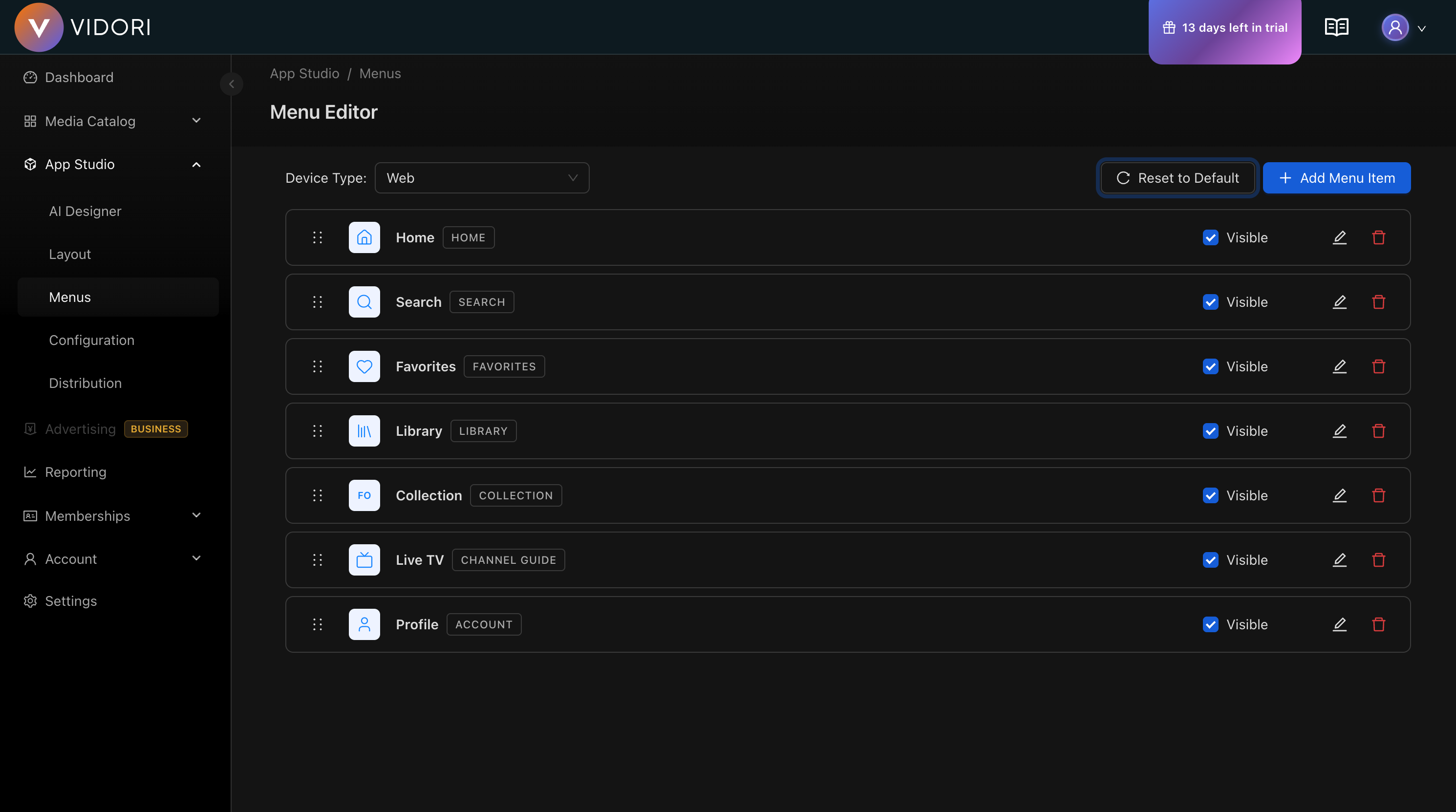
Menu Builder
The Menu Builder lets you configure navigation menus for each device type. Control which screens appear in your app’s navigation and customize their labels and icons.
Menu Structure
Section titled “Menu Structure”Menus vary by device type:
| Device | Menu Style | Location |
|---|---|---|
| Web | Horizontal nav | Top header |
| Phone | Bottom tab bar | Bottom of screen |
| Tablet | Side rail or tabs | Left side or bottom |
| CTV | Side rail | Left side |
Available Menu Items
Section titled “Available Menu Items”| Menu Item | Screen | Description |
|---|---|---|
| Home | Home screen | Main landing page |
| Search | Search | Content discovery |
| Movies | Movies browse | Movie catalog |
| Series | Series browse | Series catalog |
| News | News browse | News content |
| Live TV | Channel guide | Live channels |
| Favorites | Favorites | Saved content |
| Library | Library | Purchased content |
| Profile | Account | User settings |
| Settings | Settings | App settings |
Editing Menus
Section titled “Editing Menus”-
Select Device Type
Choose the device you want to configure from the device selector.
-
View Current Menu
The current menu items are displayed in order. Each item shows its label and icon.
-
Add Menu Items
Click Add Item to add a new screen to the navigation. Select from available screens not already in the menu.
-
Reorder Items
Drag menu items up or down to change their order in the navigation.
-
Edit Labels
Click the edit icon on any menu item to customize its label. Labels support multiple languages.
-
Choose Icons
Click the icon area to open the icon gallery and select a custom icon for the menu item.
-
Save Changes
Click Save to apply your menu configuration.
Menu Item Settings
Section titled “Menu Item Settings”Labels
Section titled “Labels”- Support multiple languages
- Keep labels short (1-2 words)
- Use clear, action-oriented text
- Consider your audience’s terminology
Choose from the icon gallery:
- Home, Search, Play icons
- Category icons (Movies, Series, News)
- User icons (Profile, Favorites)
- Settings and utility icons
Visibility
Section titled “Visibility”Toggle menu items on or off:
- Visible - Appears in navigation
- Hidden - Removed from navigation but screen still accessible via links
Reset to Default
Section titled “Reset to Default”Click Reset to Default to restore the standard menu configuration. This is useful if you want to start fresh or undo extensive changes.
Platform Guidelines
Section titled “Platform Guidelines”Mobile Menus
Section titled “Mobile Menus”- Limit to 5 items in bottom tab bar
- Use the most important screens
- Home and Search are typically essential
- Consider removing Settings from main nav
CTV Menus
Section titled “CTV Menus”- Side rail supports more items (7-10)
- Include quick access to Search
- Profile/Settings at the bottom
- Consider grouping related items
Web Menus
Section titled “Web Menus”- Horizontal nav can hold more items
- Dropdowns available for sub-navigation
- Search often in header, not menu
- Account/Profile typically in top-right
Best Practices
Section titled “Best Practices”-
Prioritize Key Destinations Put your most important content first
-
Keep It Simple Fewer menu items means easier navigation
-
Be Consistent Use similar menus across device types when possible
-
Test Navigation Verify users can find content easily
-
Consider User Journeys What do users want to do first? Make that prominent.